Key Solution 2
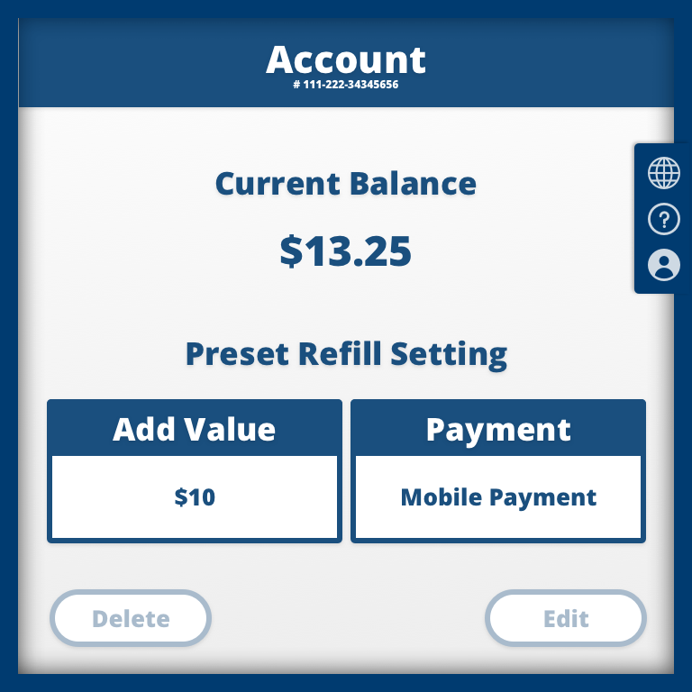
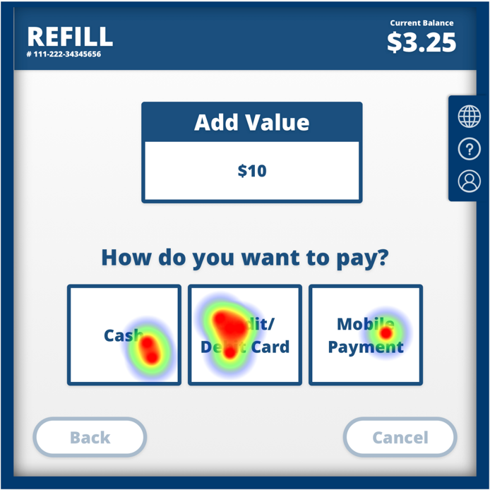
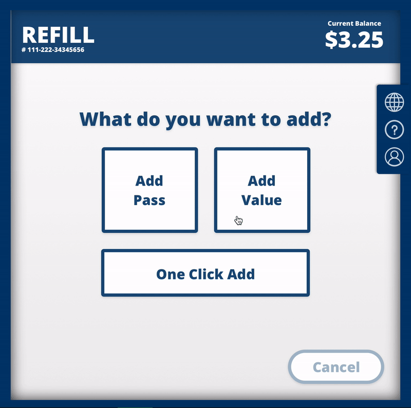
Refill the card - One Preset Click
The commuter can use the "One-click add Value" function without any clicking and refill the transit card through the preset service.
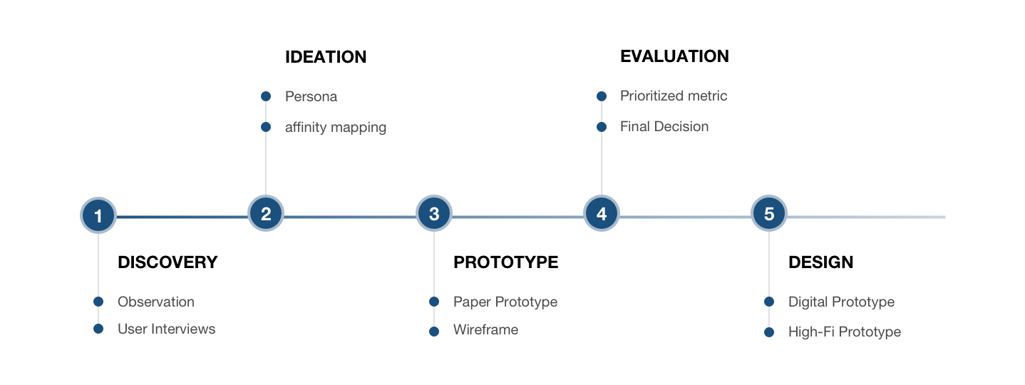
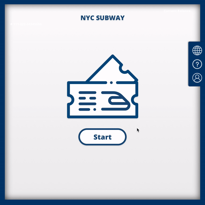
A design test from Arimo to design a kiosk for transit stop
Imagine we’re designing a kiosk at a transit stop. Its purpose is to let regular commuters buy and/or refill their transit cards. Explain exactly how this kiosk should work and the user experience you want to have.
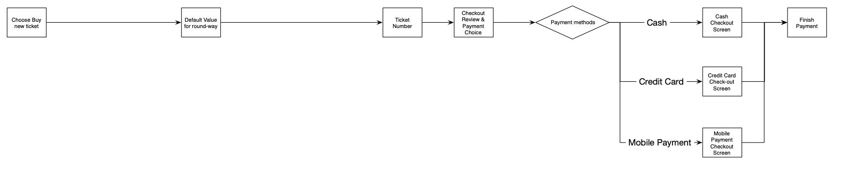
The kiosk has a 10’’ square touch screen. We will only do the basic function of payment (cash, credit card, and mobile payment).
Show us the following:
(1) Screen by screen sketches of the flow UI. Feel free to add any annotation that you think is helpful for us to understand the design choices.
(2) Hand sketches are OK.Writing of your thought process and rationale about the users, design choices, etc.
(3) At least one high-fidelity mockup screens. If you feel like you need more than one to describe the design better, please do so.
The commuter can use the "One-click add Value" function without any clicking and refill the transit card through the preset service.
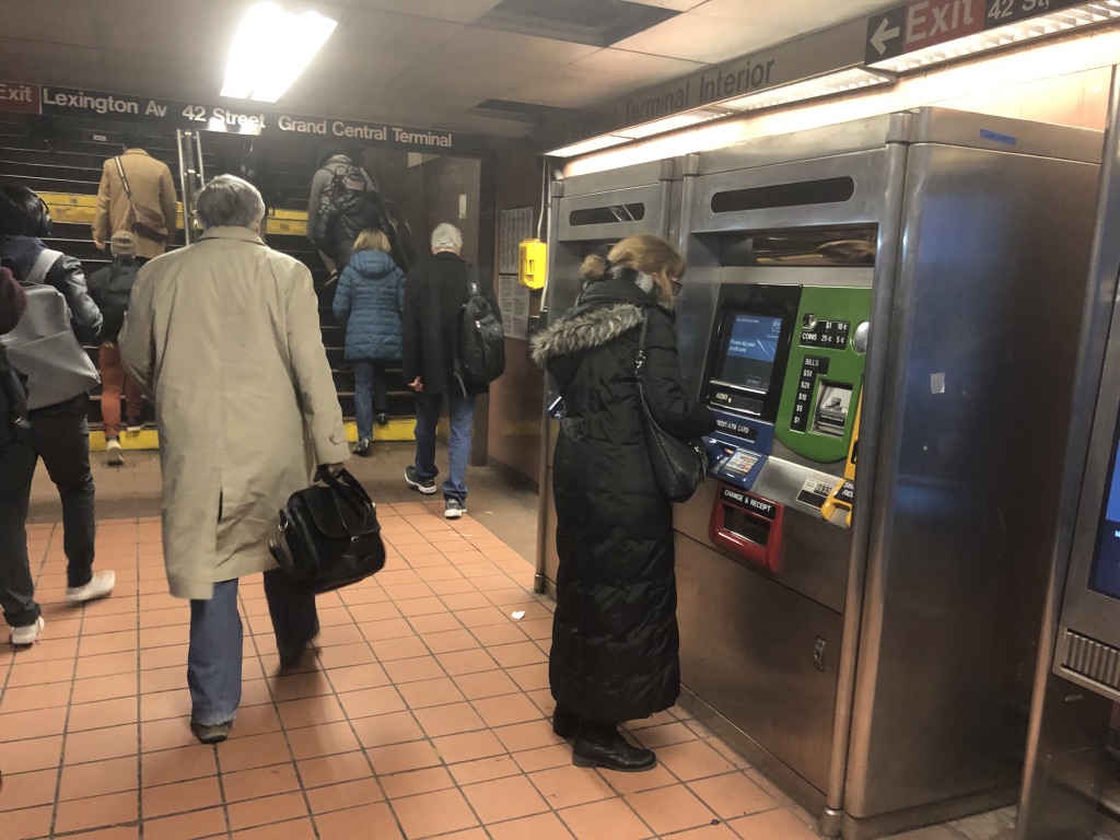
For getting more understand how usually commuters buy/refill their tickets, two different user research methods: Observation and user interview were conducted in order to understand the ticket buying/refilling experience deeply.
• Duration: 30 minutes, at 8am Aug. 5th, 2019
• Location: Grand Central in New York City
• Passengers: 20+ people
• 4 Kiosks at this entrance
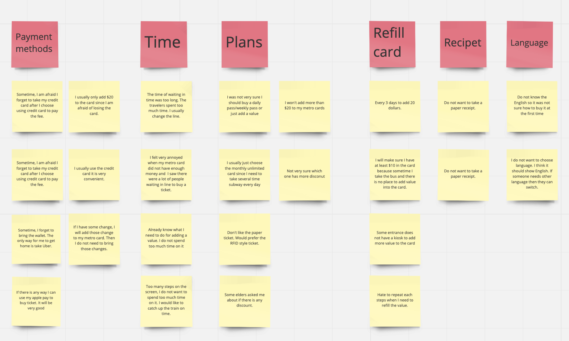
Six user interviews were conducted through face to face and remote meeting. Here is the outline of the questions that were asked during the interview:
(1) Can you talk about the recent experience in buying/refill your metro card?
(2) How often do you buy/ refill the card?
(3) How much would you like to refill each time? Why?
(4) What type of card do you prefer?
(5) What is the way you pay the fee? Why? (Cash? Credit Card? Mobile Payment?
(6) What do you like/dislike about the kiosk you are using for buying/refill the new card?
(7) Are there any situation you would like to buy/refill it, but you don’t?
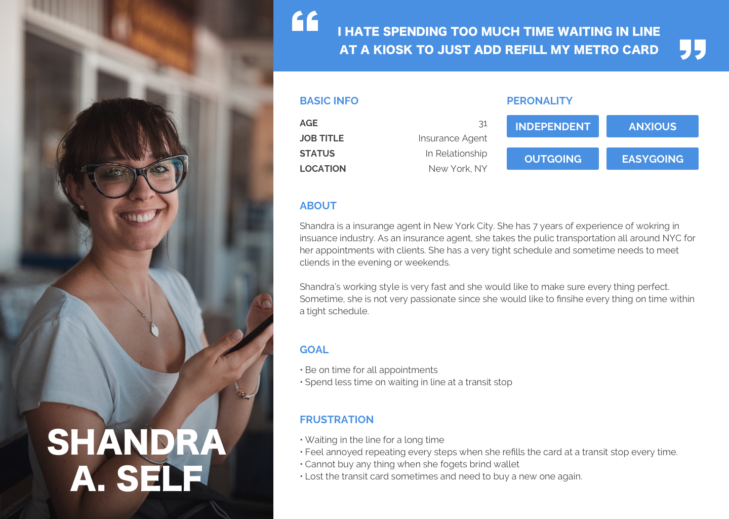
The potential of the target commuter was set up from gathering all the observation and user interview findings. Using the persona can have a clear way to get more idea what the exact problem we need to solve.
Before moving forward to the ideation about the possible solutions for each problem, I made some assumptions for a much clearer flow.
Locations
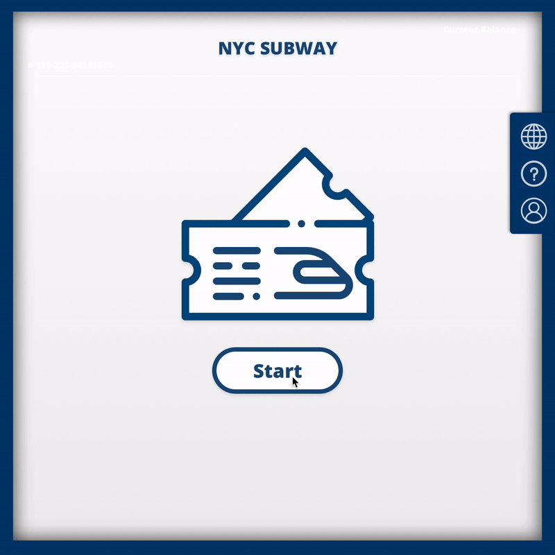
New York City Subway
Physical Kiosk
1. Each card has a specific number and the user can have a personal transit account to track their card status.
2. The card design will be like an RFID card.
Plan for the Tickets
1. The price and the plans are based on the New York Rate
2. For the adding value options, most of the uses from the interview prefer to add no more than $20 in the card. Therefore, there were only four options: $5, $10, $20, and other value.
To solve the problem about users not being sure what the problem is when they counter the complicated plans.
1. One possible solution for solving the complicated plan options is to only have a default value for new users buying a new card
2. Clear show all kinds of plans. (Unlimited card, Adding Value and Single Ride)
3. To consider about the new users and return users, add the fast pathway and multiple plans for users to have more variety options of buying a new transit card

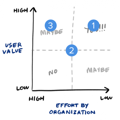
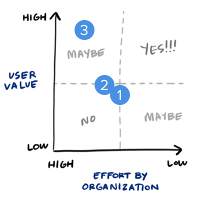
Using the prioritized metric to evaluate each possible solutions' value between the users and organization.
The ideal decision will be the 3rd option. It fit for the new user and return users who need to buy a new transit card. There were two options, either quick default value without thinking about the complicated plans and or calculating the best value of the transit card. The easiest way for the organization to build the system is only built the default value feature. However, it is not useful for return users if they would like to have more options.
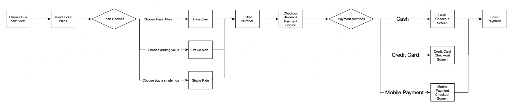
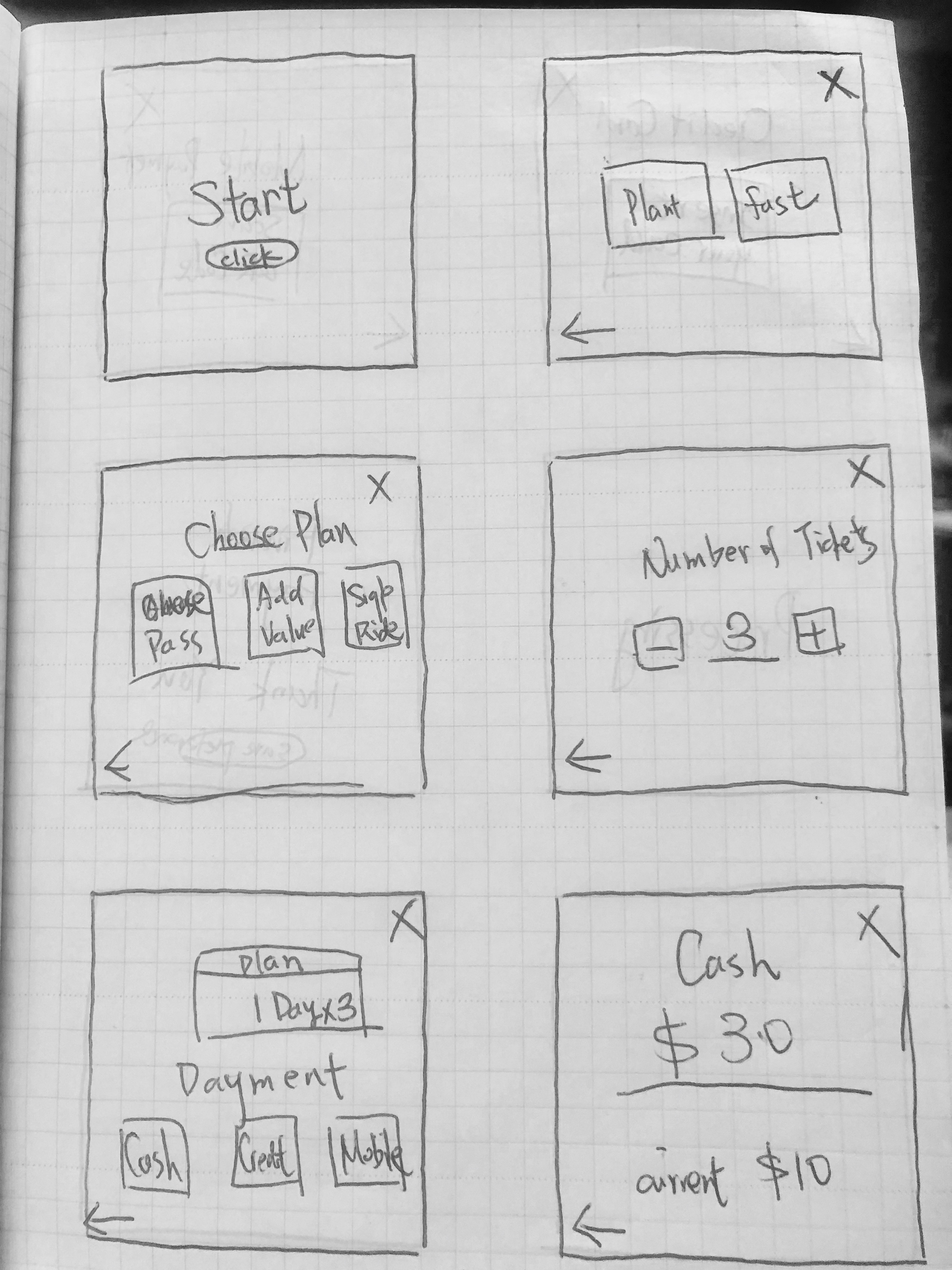
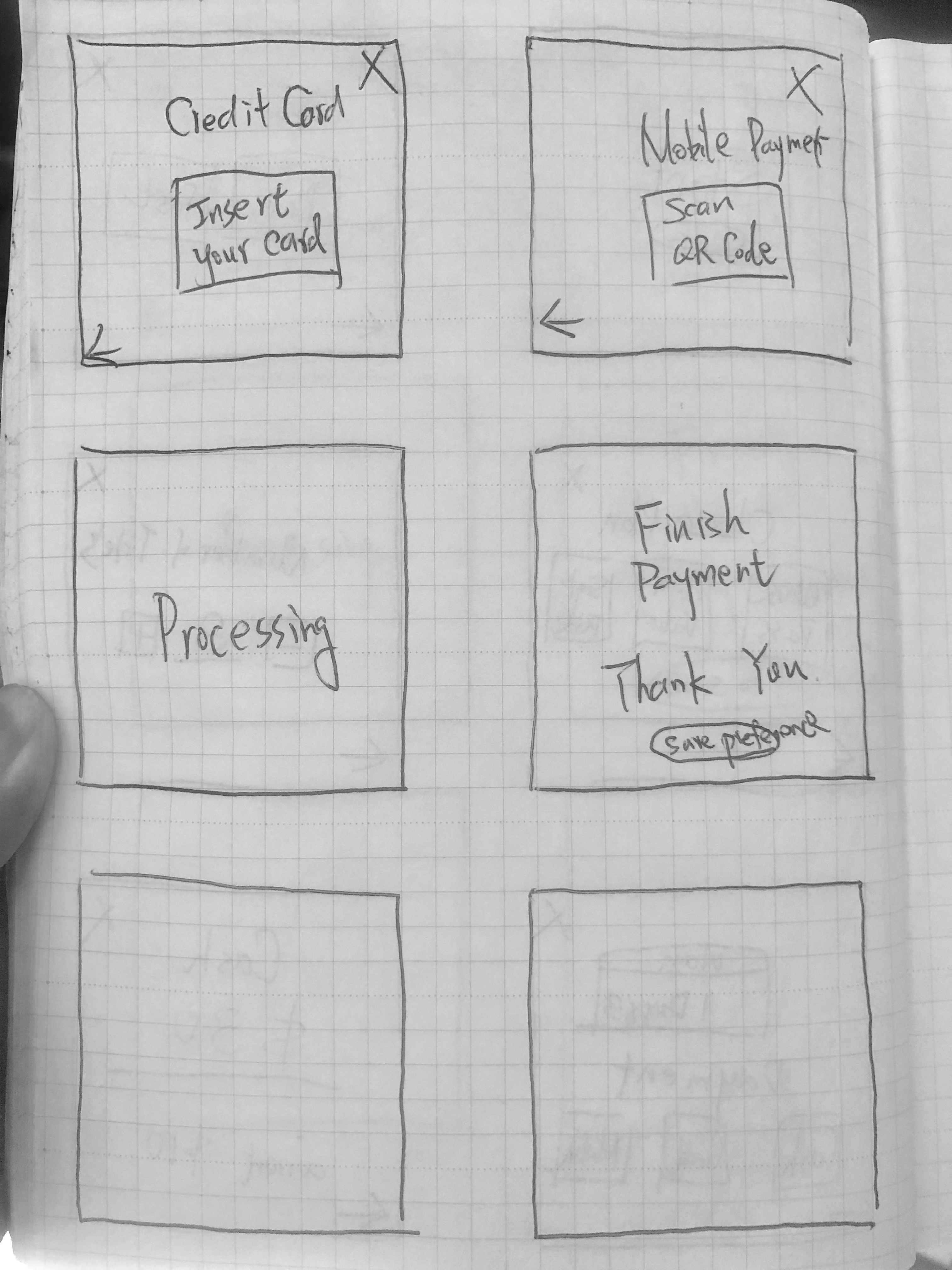
Quick sketch UI about the new card buying wireframe.
For commuters who does not familiar with the research plan, the easy way is to let them at least get a card and save a lot of time stand at the kiosk. Commuters click the default value new card and get a new card fast won't interrupt others.
Keep the same plans (Pass/Value/Ride) for users have a flexible options to meet their preference.
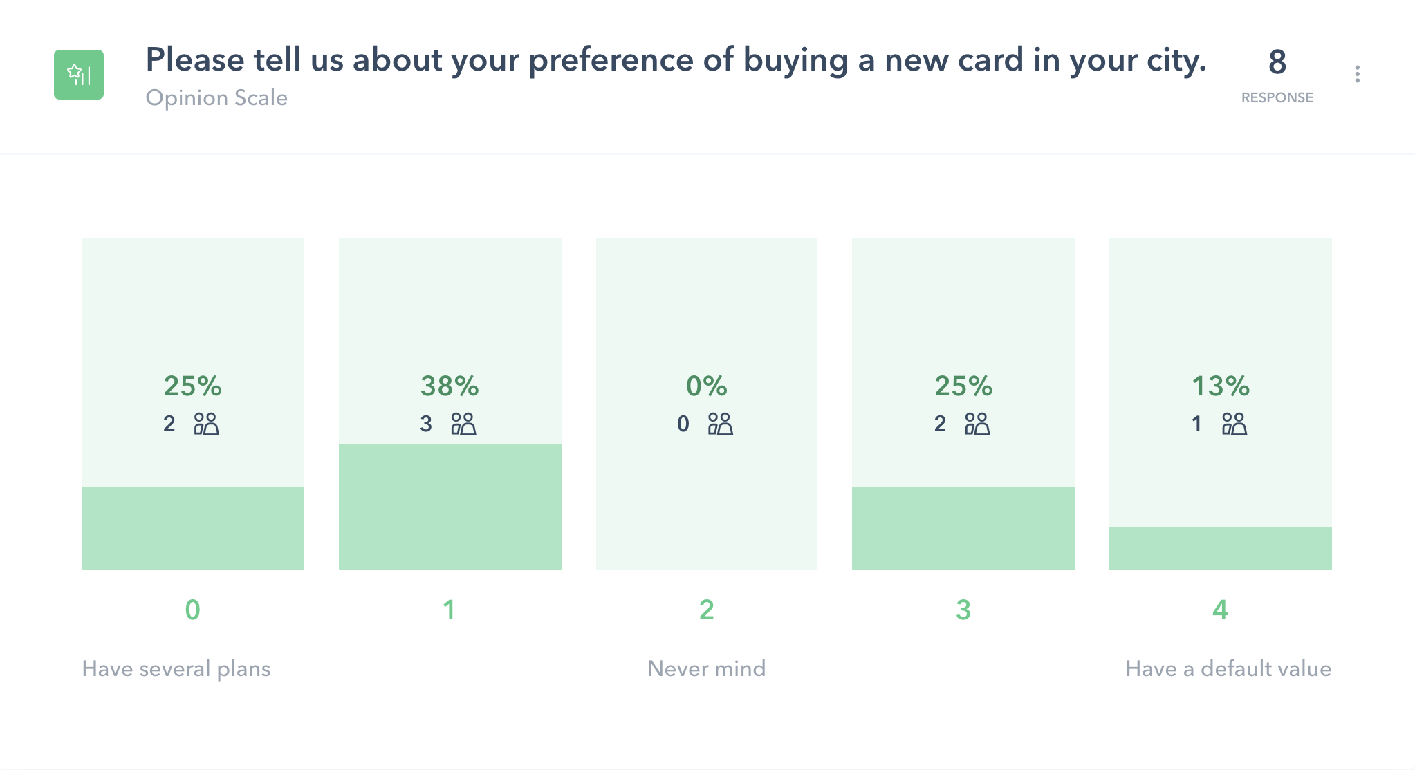
"Prefer by value"
TESTER #904826
"Giving people options is better. Less option isn't better"
- TESTER #4646777
"It seemed normal"
- TESTER #2227417
"The simplest would be to have a default value for new clients. "
- TESTER #1907763
"It has value. I would tend to prefer options, but if the default option is what I want or very close then it is very convenient. "
- TESTER #2650381
"its not bad"
- TESTER #2220068
To solve the problem about the long waiting time and repeating steps issue for the returning users.
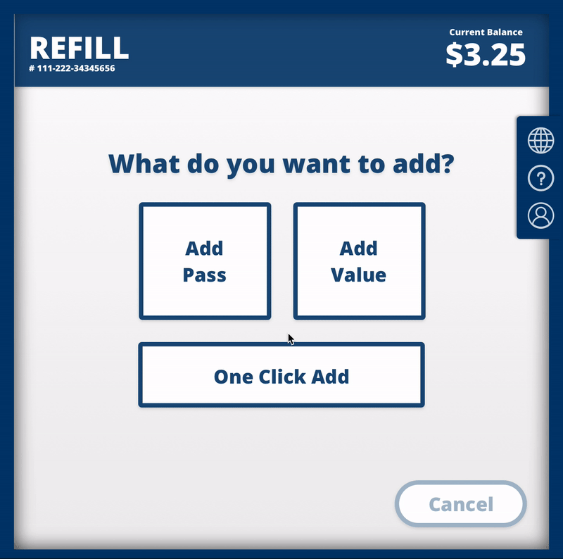
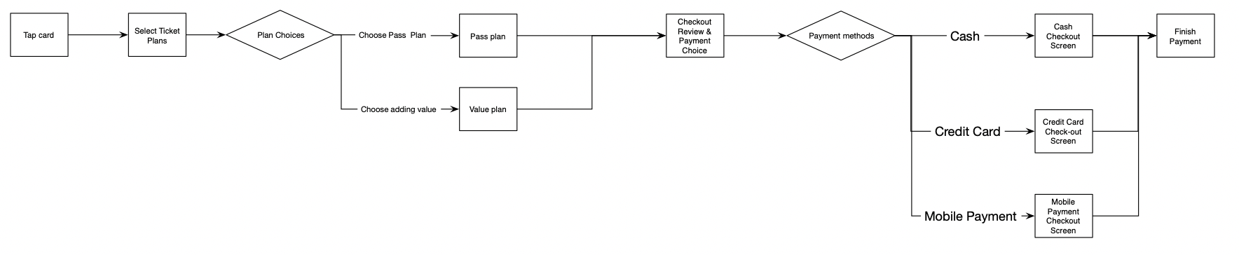
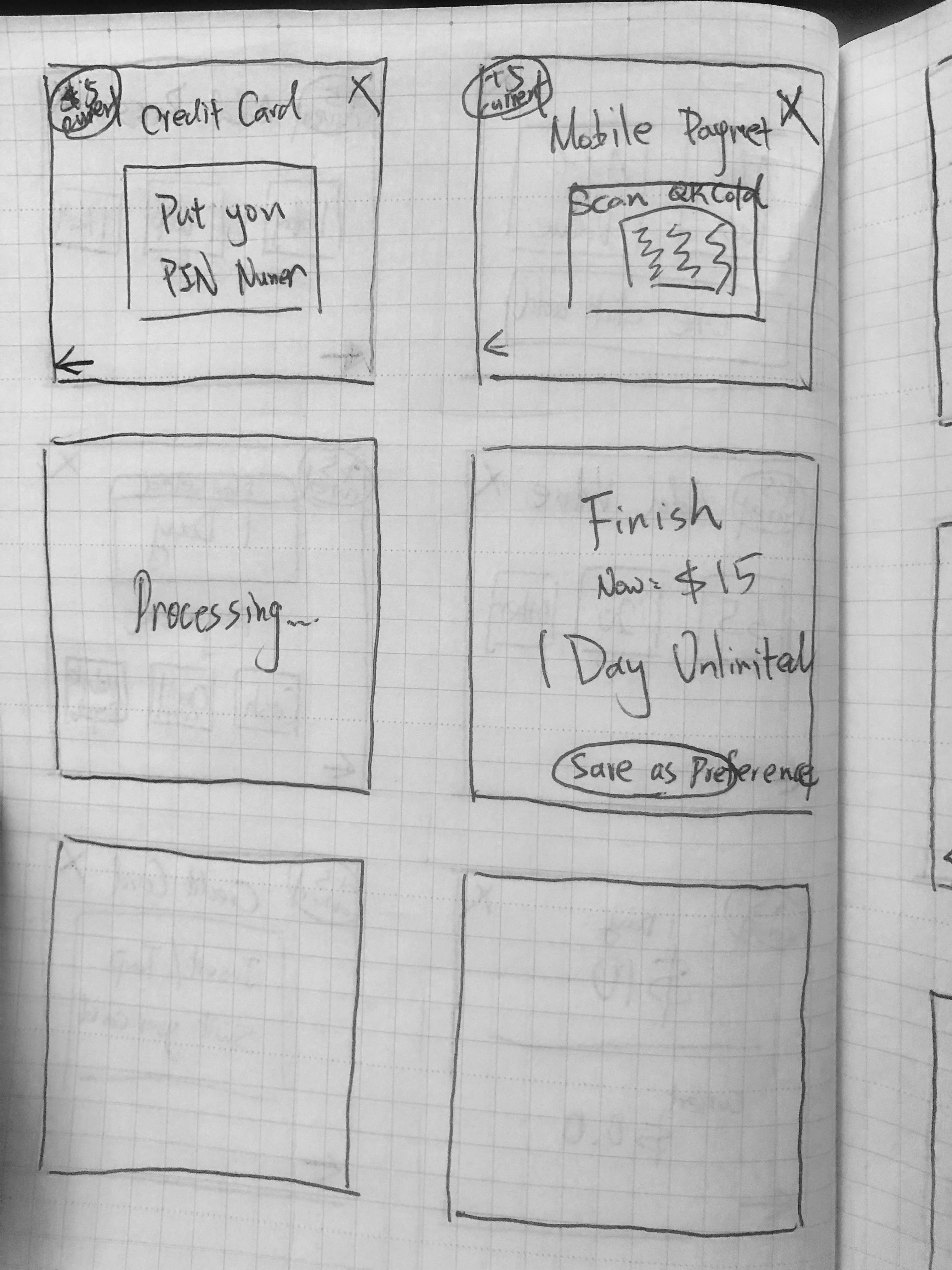
1. A similar flow with the buying a new card. The commuters need to select to refill the card at the beginning and then insert the card to refill the transit card.
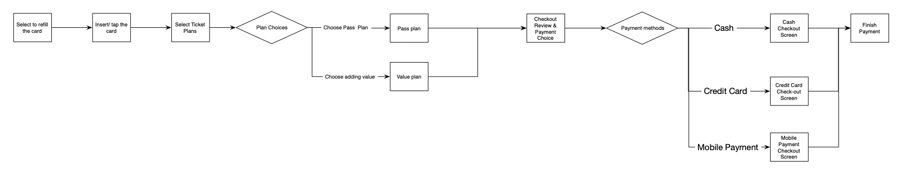
2. When users insert/tap the card, the screen jump to the plan selection directly. Users do not need to choose buy/refill the transit cards

3. Add the customize setting in advance. Users have the "one tap/insert choice" and pay the fee to refill transit card.
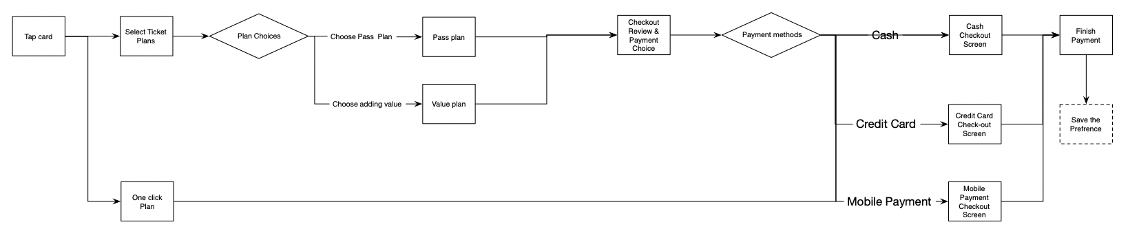
The ideal decision will be the 3rd option if the development team can put their best effort to create more functions. The commuters can save a lot of time from the "One Tab" function. They do not need to repeat the refill steps every time. However, if the organization does not have time to build the additional feature, the 2nd option will be the best when we consider the user value and the effort by the organization.
Quick sketch UI about the refill flow.

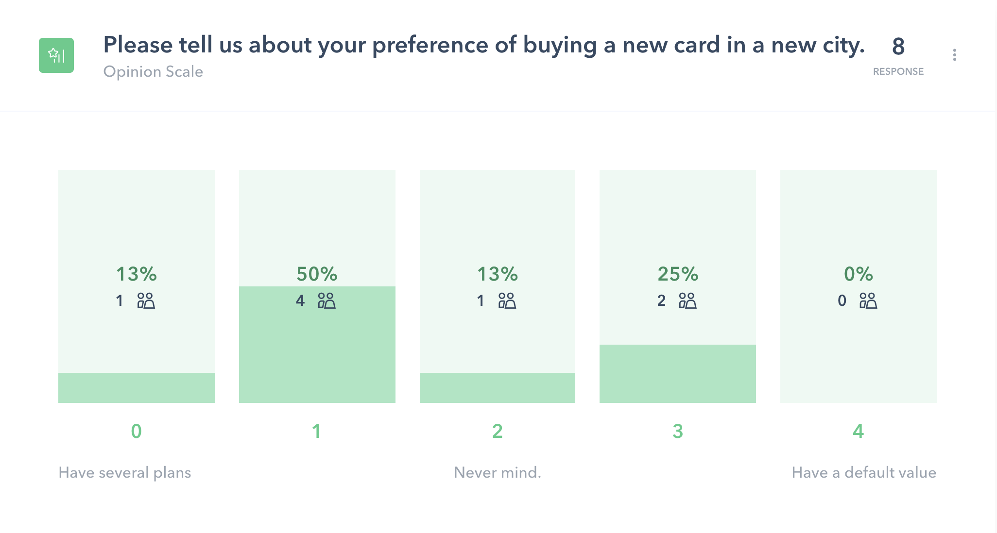
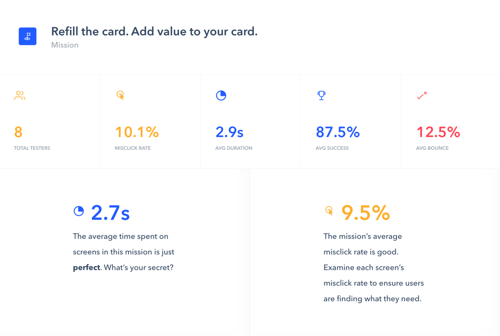
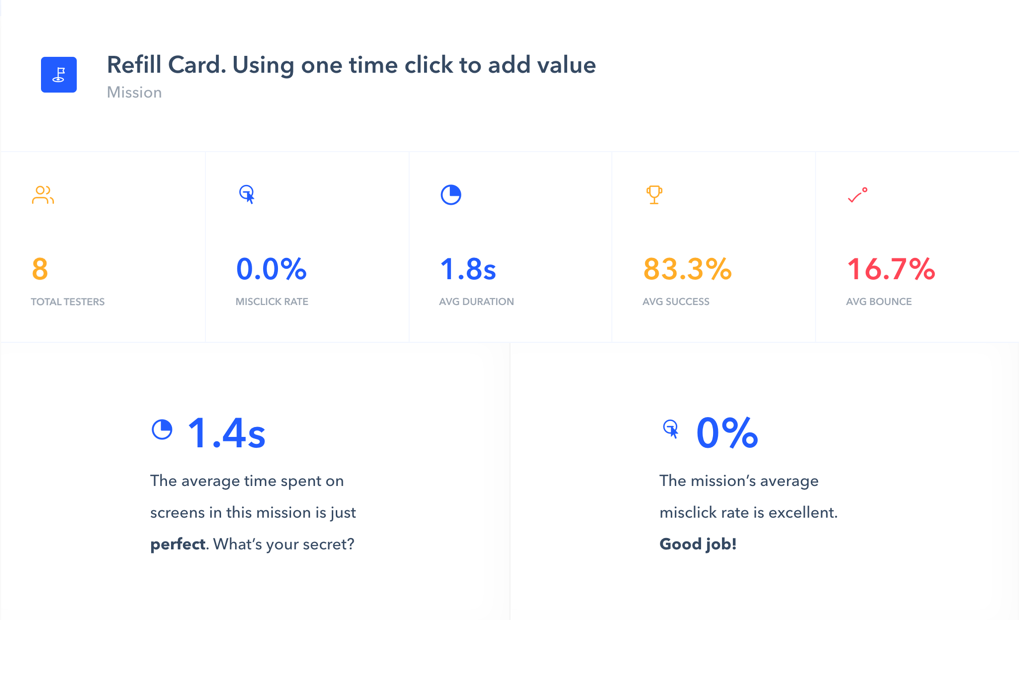
To know about the idea about how people feel about the "One-Click" option, I did a A/B testing to know about which one users can spend less time on it and fell more easily to use it.
"It depends on what I use the card for. I would use regular if I wanted to add the same value every so often. I would use one time if I wanted to add a specific value and only once during an off time. "
TESTER #904826
"I prefer the one-time click"
- TESTER #4646777
"I thought it was easy to use."
- TESTER #2227417
"One time click seems great if I want to add the predetermined amount. I would use this. "
- TESTER #1907763
"Convenient and easy. i do worry about misclicks."
- TESTER #2650381
"I think it is very convenient and I prefer this function"
- TESTER #2220068